Introduction
What is the essential story being told by your site and what type of structure did you choose to implement?
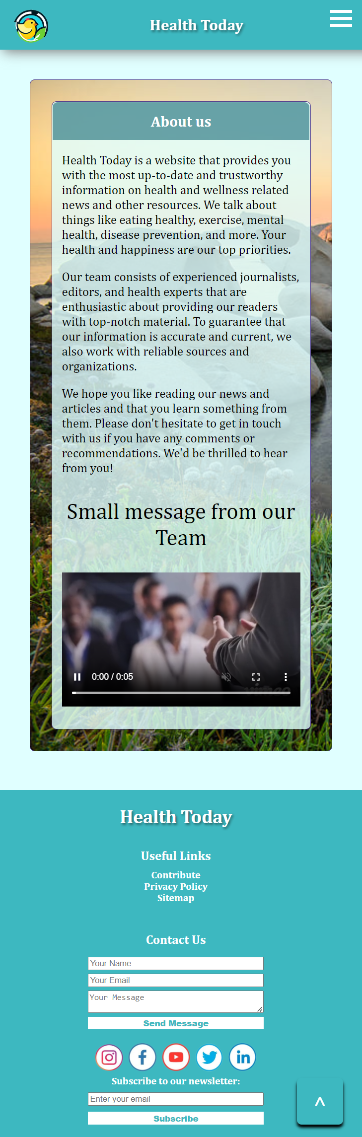
The essential story being told by Health Today is that it is a reliable source of health and wellness information. It strives to give useful information and resources to assist people live healthier lives. The first page which is the index page showcases its expertise and credibility through the data section, highlighting the years of experience, the number of people reached annually, and the number of medical experts involved. This establishes the website as a reliable source of information.
In terms of structure, the layout of Health today is mostly straightforward and clear. It follows a typical layout commonly found in health and wellness websites. Health Today includes news and wellness articles on various subjects such as exercise, food, diseases, anxiety, trends etc, which are common topics of interest for individuals seeking to improve their overall well-being.
Additionally, Health Today incorporates rich media such as images, gifs, videos and resources to make the content more engaging, appealing and useful. The use of headings and subheadings helps organize the information and make it easily scannable for visitors looking for specific topics.
Overall, the chosen structure effectively conveys this website's purpose of providing valuable health and wellness information. It presents the information in a clear and organized manner, making it accessible and user-friendly for visitors seeking to improve their health and well-being.
Inspiration
State 3 things that have inspired you when creating your website (e.g. guest speakers, websites, artists, blogs).
1. https://www.health.com/ - This website is a heavy inspiration for Health Today. I have taken all the articles which I wrote in my own words and most of the images from there. I was impressed by the use of white space on health.com. I noticed how the website utilized ample white space to create a clean and organized layout, allowing the content to breathe and making it easier for users to focus on the information presented. This inspired me to adopt a similar approach, ensuring that the design was not cluttered and overwhelming for the users. I was inspired to create the same organized layout design for the first (index) page.
Another inspiration taken from health.com was the use of visually appealing and high-quality images. This website made me understand the importance of engaging visuals in capturing the attention of visitors and conveying the overall message of the website. This website carefully selected relevant and captivating images to accompany the content and enhance the user experience.
2. https://www.noisli.com/ and https://www.omnicalculator.com/health - Websites like these inspired me to create various tools like scenic sounds, health calculators etc.
3. https://www.psychologytoday.com/us - This website is the inspiration behind my website title name 'Health Today'. The title is simple and it conveys the message that the website includes and talks about everything related to health, like news and other various topics.
Accessibility
State 3 ways in which your site is accessible.
1. Font size and Font weight - Font size of website's main text is increased and set the most texts' font weight to bold or bolder. It is especially beneficial for individuals with weak vision.
2. Simple Language - People with cognitive disabilities, such as dyslexia or ADHD, may find it difficult to process complex language. Using simple language can make it easier for them to understand and engage with the content.
3. Clickable links - When a person clicks on a link, it will smoothly scroll to a specific section of the page, such as a news article that the link refers to. Smooth scrolling to a specific section of a page when a link is clicked can make it easier for people with disabilities to navigate the website. For people with mobility impairments, who may have difficulty using a mouse or trackpad, this feature allows them to quickly access the content they are interested in. For users with visual impairments, smooth scrolling can help them keep track of their location on the page as they navigate, reducing confusion and disorientation.
Usability
State 3 ways in which you considered the usability of your site.
1. Website is responsive. It works on desktop, tablet, mobile and smaller mobile screens.
2. In mobile or smaller mobile view, the navigation bar is replaced by a burger menu, Search bar and all the links are organised vertically inside a burger button.
3. I have include Ai therapy (I did not wrote the code myself). Chatbots are available round the clock, providing constant support to users. By including this on my website, I can provide a convenient and accessible option for users seeking mental health support.
Learning
State 3 things you had to learn or find out to create your site. How did you achieve that?
1. I learned how to create a responsive design that works on most screens. I learned this by using numerous resources, such as W3Schools website, sabe.io to understand CSS properties and HTML. I achieved this by creating categories with specific values and labelling them, for example, values from max-width 1292px to min-width 880px were labeled for tablet screens.
2. I learned a lot whilst changing a little bit of all of the reused code such as AI therapy, Mobile navbar and BMI calculator that belongs to other people. I learned a little bit about how AI works, there are questions and responses. In BMI calculator I added if and else statements and through BMI calculator, I was able to achieve and write a Javascript code for Protein intake calculator by myself.
3. Finally I learned how to create scenic sounds. While going through sabe.io and W3Schools, I was able to achieve and write my own Javascript code.
Evaluation I
What aspects of your work do you think were particularly successful? Why?
I am happy with how my website turned out. As a beginner in web development, I mostly wrote or used code in a simple way. I implemented almost everything, from animation to rich media to JavaScript, in a simple way. I also think the main colors that I used on the background, navbar, and footer look great - colors like cyan, both in darker and lighter shades.
The code for the scenic sounds and protein intake calculator, which I wrote myself, also turned out to be successful.
Evaluation II
What aspects of your work could be improved? How might you do things differently another time?
Responsiveness and positioning of items could be improved. Making a website responsive can be a complex process that requires careful planning and attention to detail. It involves testing the website on a variety of screen sizes to ensure that it looks and functions well on all of them. Implementing CSS on smaller screen sizes proved to be challenging especially the positioning part because whenever it was displayed on different screens, it would create a lot of white space. I might do this differently next by learning and using CSS framework like Bootstrap. These frameworks provide pre-built components and styles that can help create a responsive layout more easily. They also include tools for managing the positioning of elements on different screen sizes, which can help reduce the amount of white space and improve the overall user experience.
Resources
What resources did you use in your work? List any sources of information, libraries, plugins, code or tools (you should also indicate inclusions from other sources within your code using comments)
Note: Detail of each resource is mentioned in code commenting
• Main resources used for implementing the site:
- W3 Schools, HTML and CSS reference. Basic JavaScript Help
- W3C Markup validation service
- health.com (For design inspiration of index page and for reusing articles and some images)
- Miicrosoft Edge AI image generator
- sabe.io
- Visual Studio Code
- Other various websites for reusing images (Detail mentioned in code commenting)
- Paint (For Editing images like wireframes)
• citations:
code:
[1] L. Embrey, '17 Beautiful JavaScript Menus You'll Love', 2022. [Online]. Available: Link
[2] A. CodeWithRandom, 'How to Create a Chatbot using HTML, CSS and JavaScript Code', 2023. [Online]. Available: Link
[3] Unknown Author, 'BMI Calculator', 2023. [Online]. Available: Link
[4] Dahui, 'JavaScript collapsible panel open by default', 2018. [Website] Available: Link
Resources:
[1] W3 Schools, 'documentation of HTML and CSS', 2023. [Online] Link
[2] W3 Validator, 'source code validation tool for HTML and CSS', 2023 [Online] Link
[3] Microsoft, 'Bing Image Creator', 2023. [Online] Link
[4] F. Font, 'Freesound.org: a collaborative database of Creative Commons Licensed sounds', 2005. [Online] Link
[5] Full Website image capture, 'GoFullPage - Full Page Screen Capture', Unknown Year. [Chrome Extension] Link
[6] Octopus, 'Visual sitemap designer', 2023. [Website] Link
[7] Health.com, 'First page design inspiration and reusing articles and some images', 2023. [Website] Link
Appendices
Site map (if useful), wireframes and mock-ups
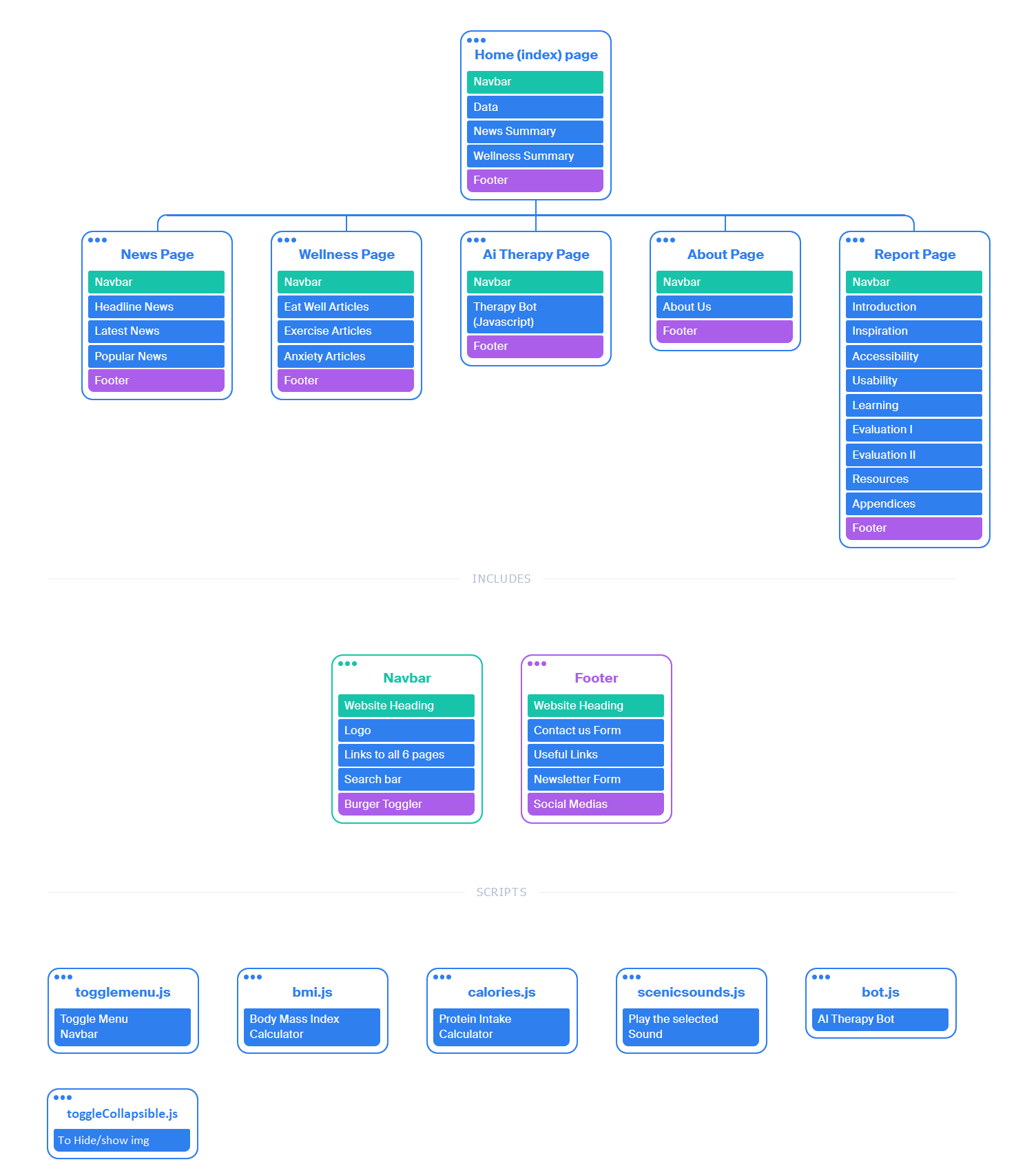
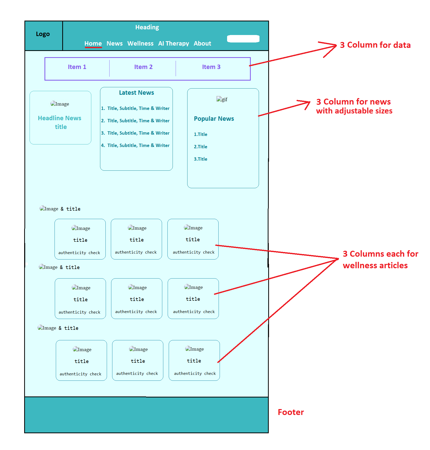
Landing page
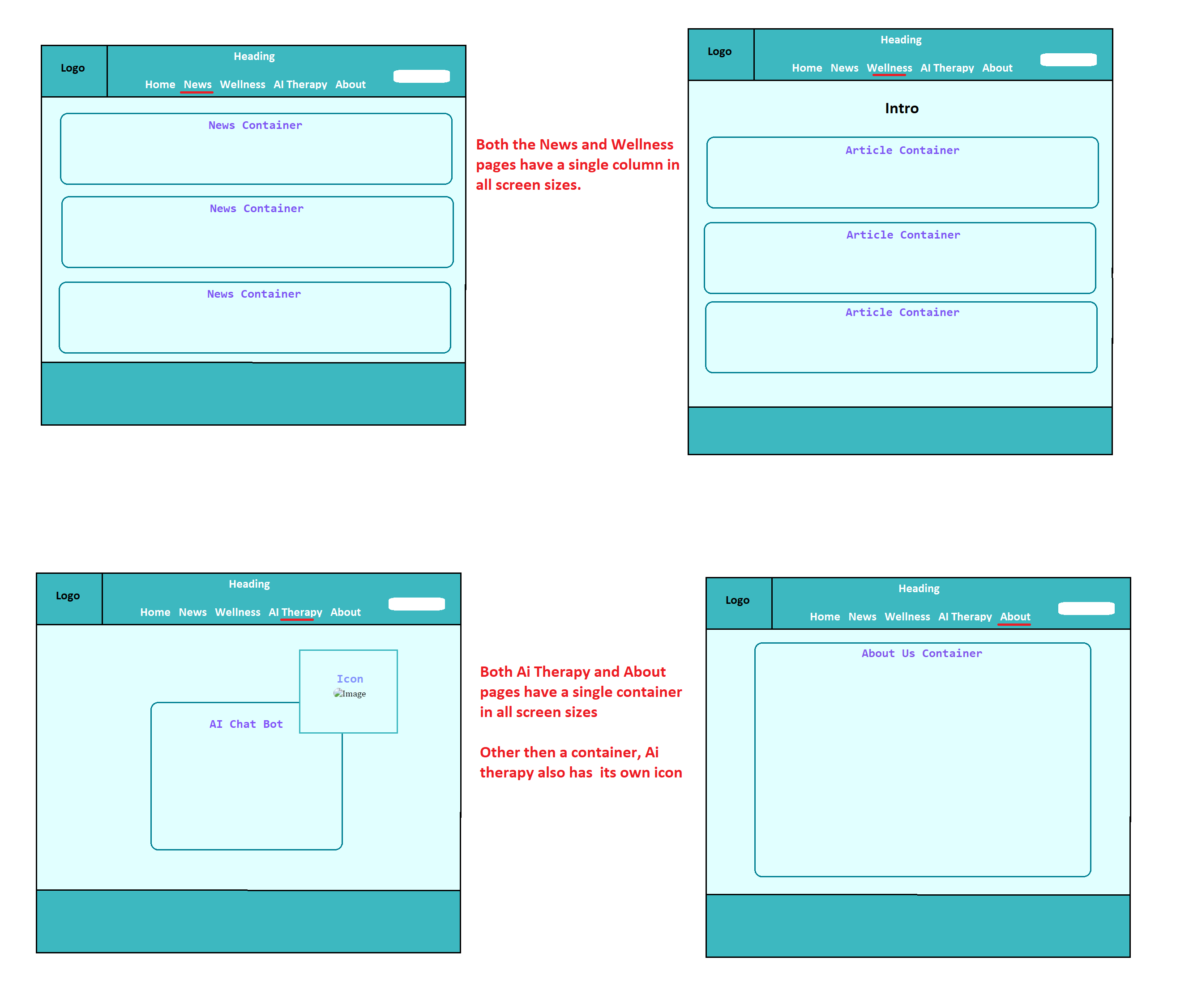
News page
Wellness page
AI Therapy page
About page
Responsive Landing page

News page

Wellness page

AI Therapy page
About page